Change scale of value axis: minimum, maximum number to display, major interval.
In Calc, the values displayed with the axes of a chart are normally the default ones which are selected by the system as per the data being used. In some cases, we might need to change these values, or require different intervals between two successive values. In all such cases we need to change the scale of value axis.
Image may be NSFW.
Clik here to view.
Clik here to view.

Image may be NSFW.
Clik here to view.
Clik here to view.

Image may be NSFW.
Clik here to view.
Clik here to view.

Image may be NSFW.
Clik here to view.
Clik here to view.

Image may be NSFW.
Clik here to view.
Clik here to view.

Image may be NSFW.
Clik here to view.
Clik here to view.

Image may be NSFW.
Clik here to view.
Clik here to view.

Image may be NSFW.
Clik here to view.
Clik here to view.

Image may be NSFW.
Clik here to view.
Clik here to view.

Image may be NSFW.
Clik here to view.
Clik here to view.

Image may be NSFW.
Clik here to view.
Clik here to view.

Image may be NSFW.
Clik here to view.
Clik here to view.

Image may be NSFW.
Clik here to view.
Clik here to view.

To change the scale of value axis, first of all select the chart. After this, click on ‘Format’ from the main menu bar, and from the resulting menu, click on ‘Axis’. This will display a sub-menu. Click on ‘X Axis’ or ‘Y Axis’ from this sub-menu as per the requirement. This will open the ‘X Axis’ or ‘Y Axis’ dialog box.
Image may be NSFW.
Clik here to view.
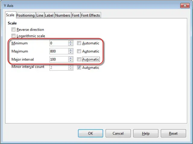
In this dialog box, under the ‘Scale’ tab, we have some options like ‘Minimum’, ‘Maximum’ and ‘Major interval’. Uncheck the ‘Automatic’ checkboxes in front of these options and then you can add the minimum and maximum numbers to be displayed, or the major interval between the axis values. After making all the changes, click on ‘OK’. The scale of value axis will get changed accordingly.